Cake Wrecks
Overview
Cake Wrecks needed a face lift for their outdated blog site. The goal was to help CakeWrecks.com gain more site traffic by improving the site's usability. This client knew something about their site need to change but wasn’t quite sure how to identify its problems. After several phases of user and audience testing, our team was able to pinpoint Cake Wrecks' pitfalls. What followed was a full site redesign.

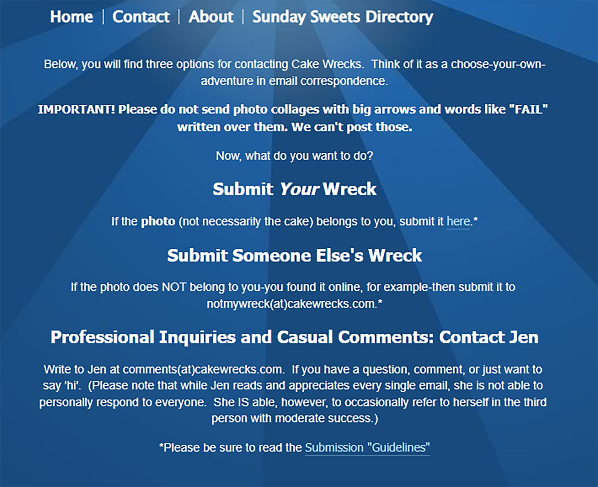
We invited users within our main demographic to help us identify which aspects of Cake Wrecks needed improvement. Users found the website layout confusing, overwhelming, and didn’t feel it had much credibility due to broken links and grammatical errors.
Approach
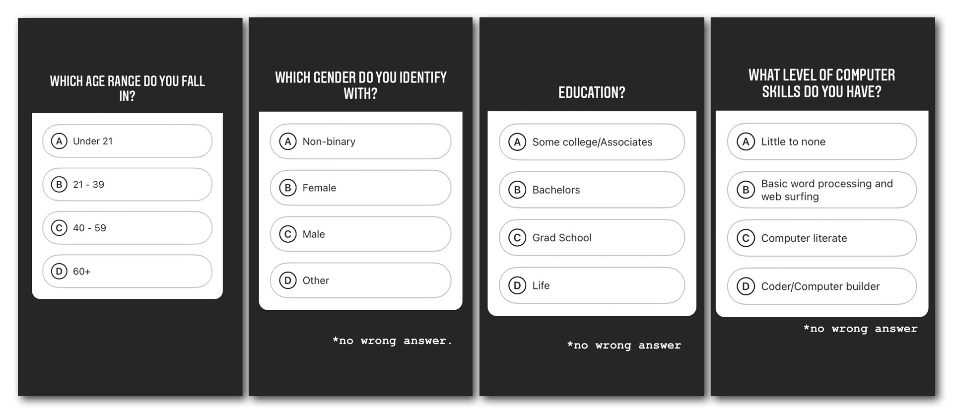
First, user research was conducted using online survey responses, where our team evaluated demographics and psychographics of potential users of Cake Wrecks, based on over 100 responses from current and potential users of the site.
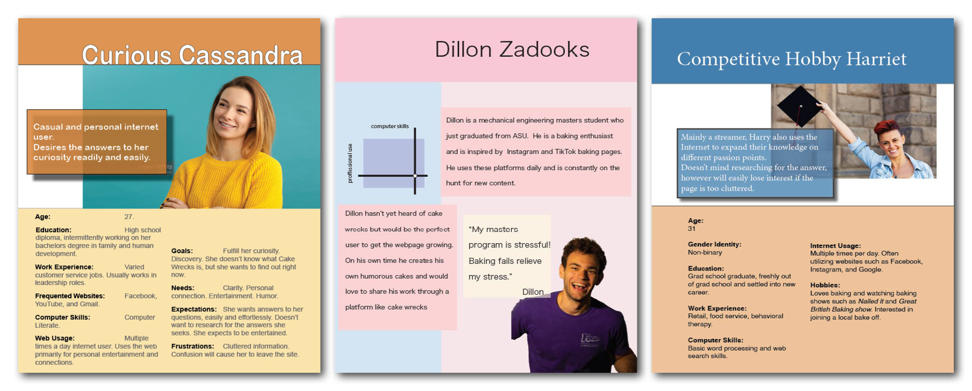
Based on the user research gathered, our team crafted 3 fictional personas of users of Cake Wrecks, including their goals, wants, and needs.
We evaluated the site based 123 different usability guidelines, within 5 categories: Home page usability, Navigation and information architecture, Trust and credibility, Writing and content quality, and Page layout and visual design.
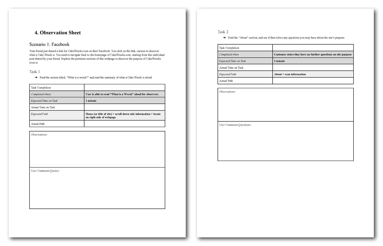
Six real life users were selected for usability testing. These participants were demographically aligned as current or potential users of Cake Wrecks. The participants were given scenarios and tasks to complete on the website to determine the most pressing usability issues.
Solution
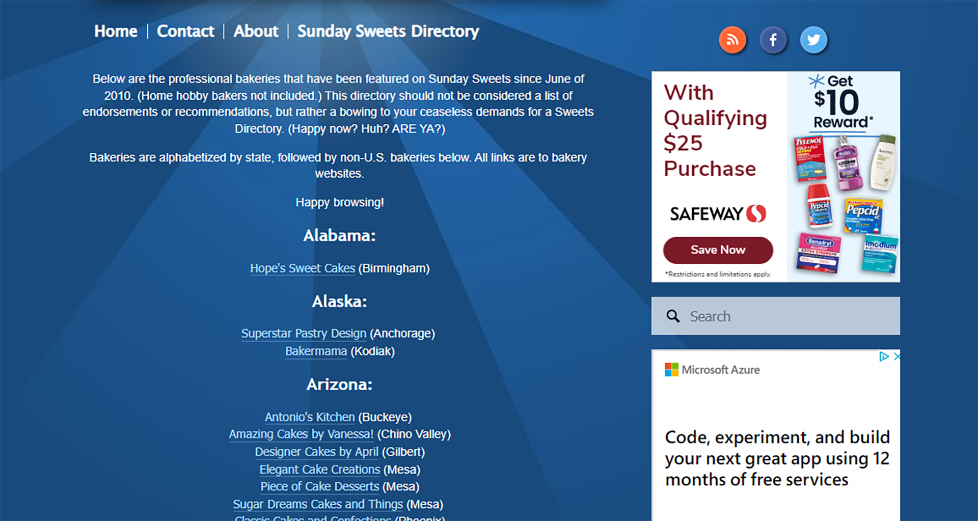
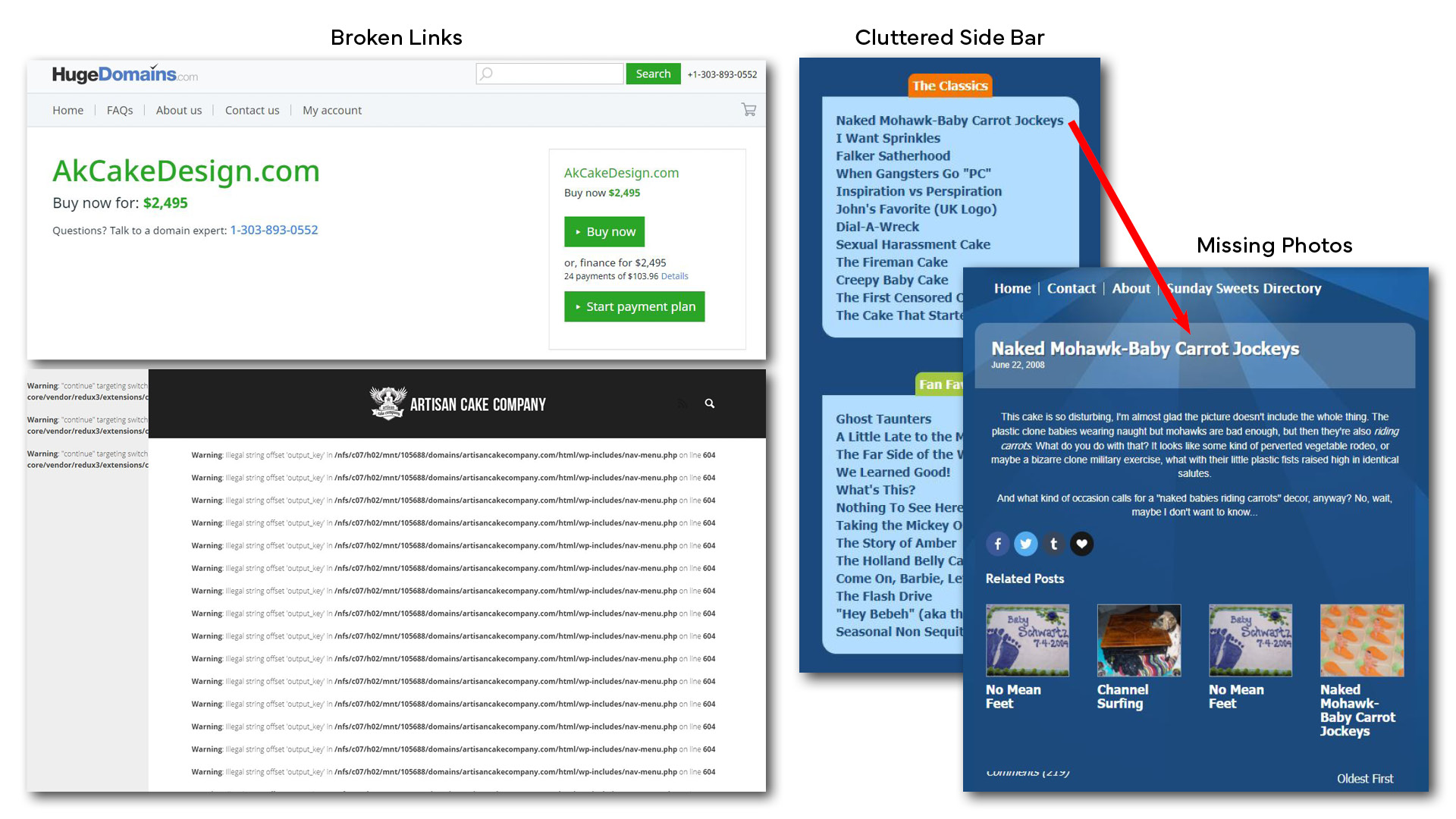
Many broken, nonexistent, or outdated links needed to be updated. Many links within the site directory led users to outdated or nonexistant pages. We found cluttered sidebars with sections like "Fan Favs," many of which lead to deleted articles, or nonexistent photos.
The search bar was not located in the same place on every page, so we suggested giving the search bar a fixed location that's visible from each page. To aid users with specific searches, we suggested a sorting system for the search feature, which would include categories like; Most Viewed, Recent, or Suggested.

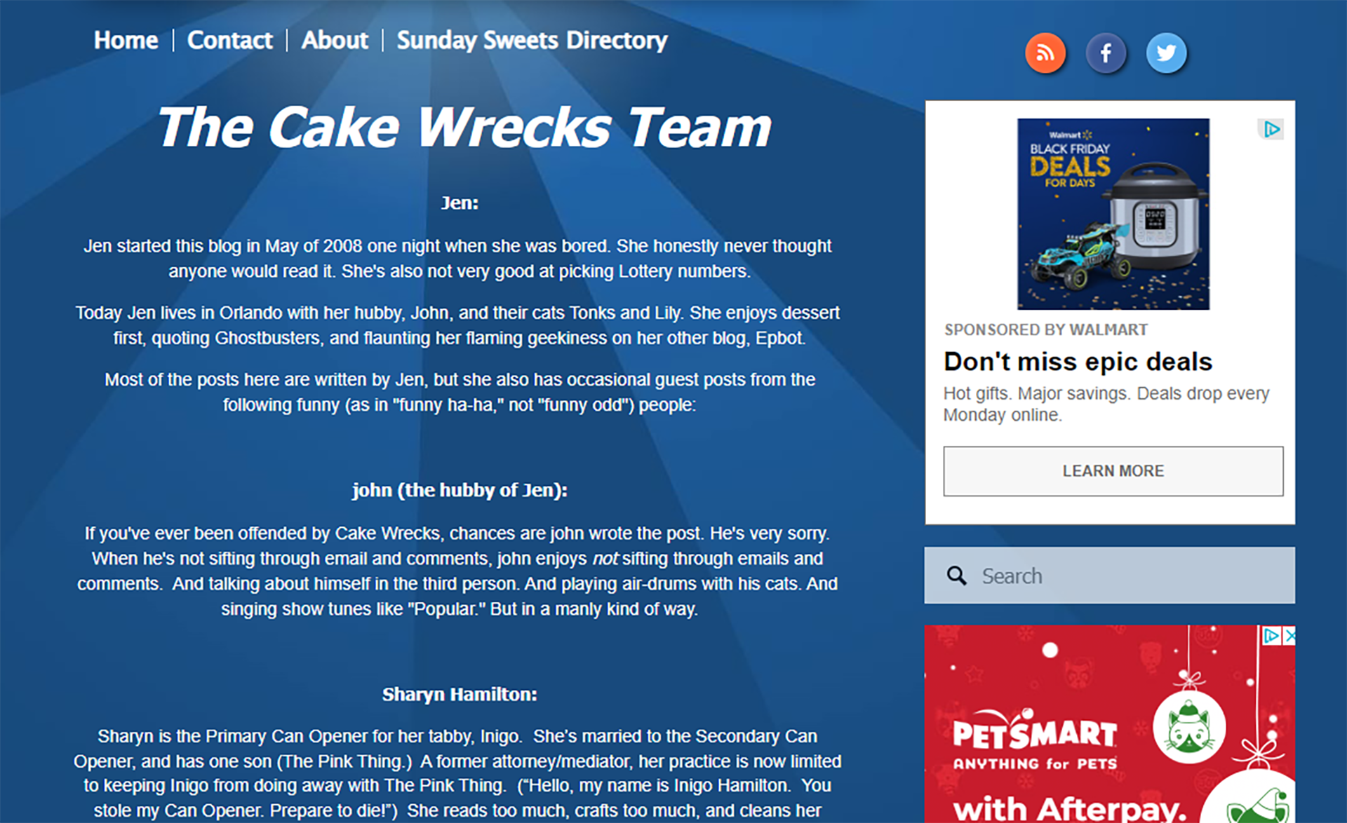
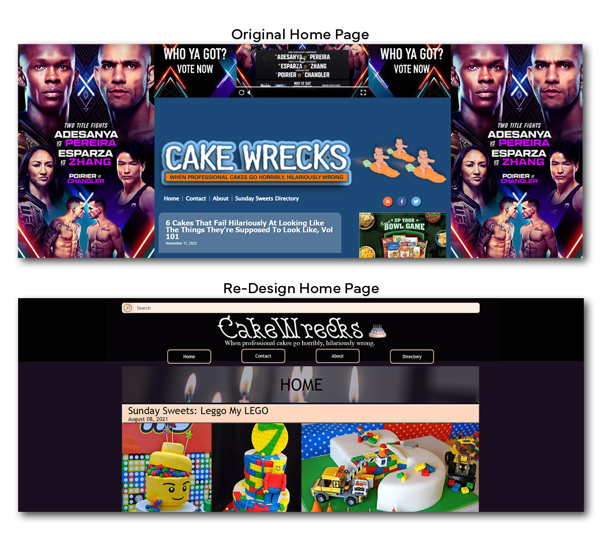
A handful of things contributed to the visual clutter: lots of ads, a poor hierarchy of information, ambiguous separation of content made it difficult to tell between different sections, and the bright blue background with orange header colors clashed.
Results
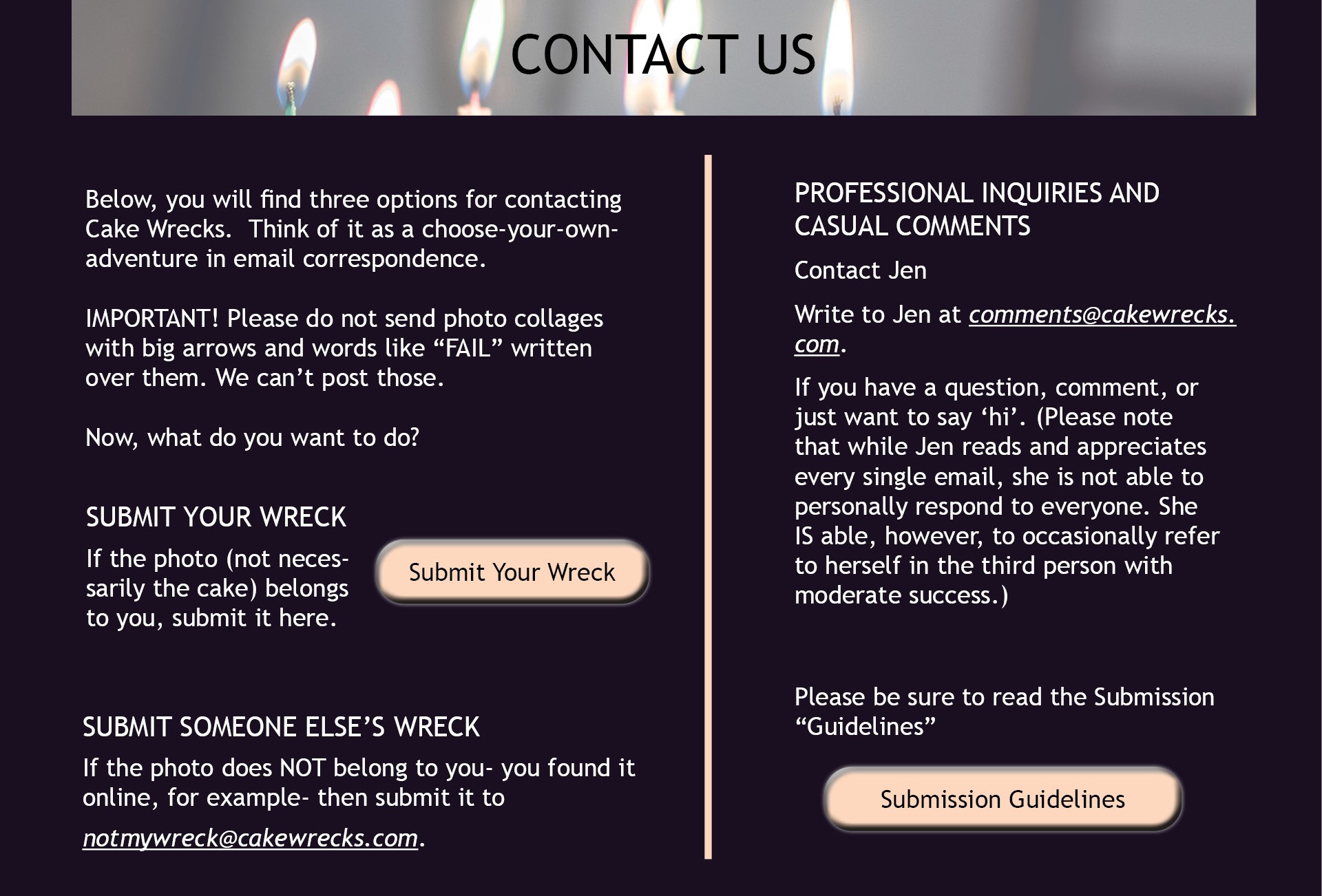
Our participants found Cake Wrecks to be visually cluttered and were displeased with a lack of clear visual hierarchy on the site. These issues were addressed during the redesign, and mockups of a complete site overhaul were produced.
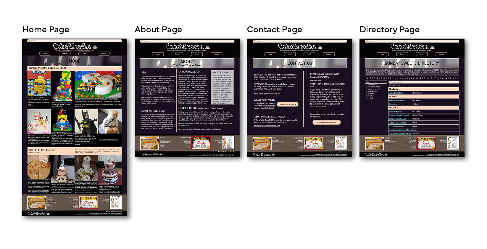
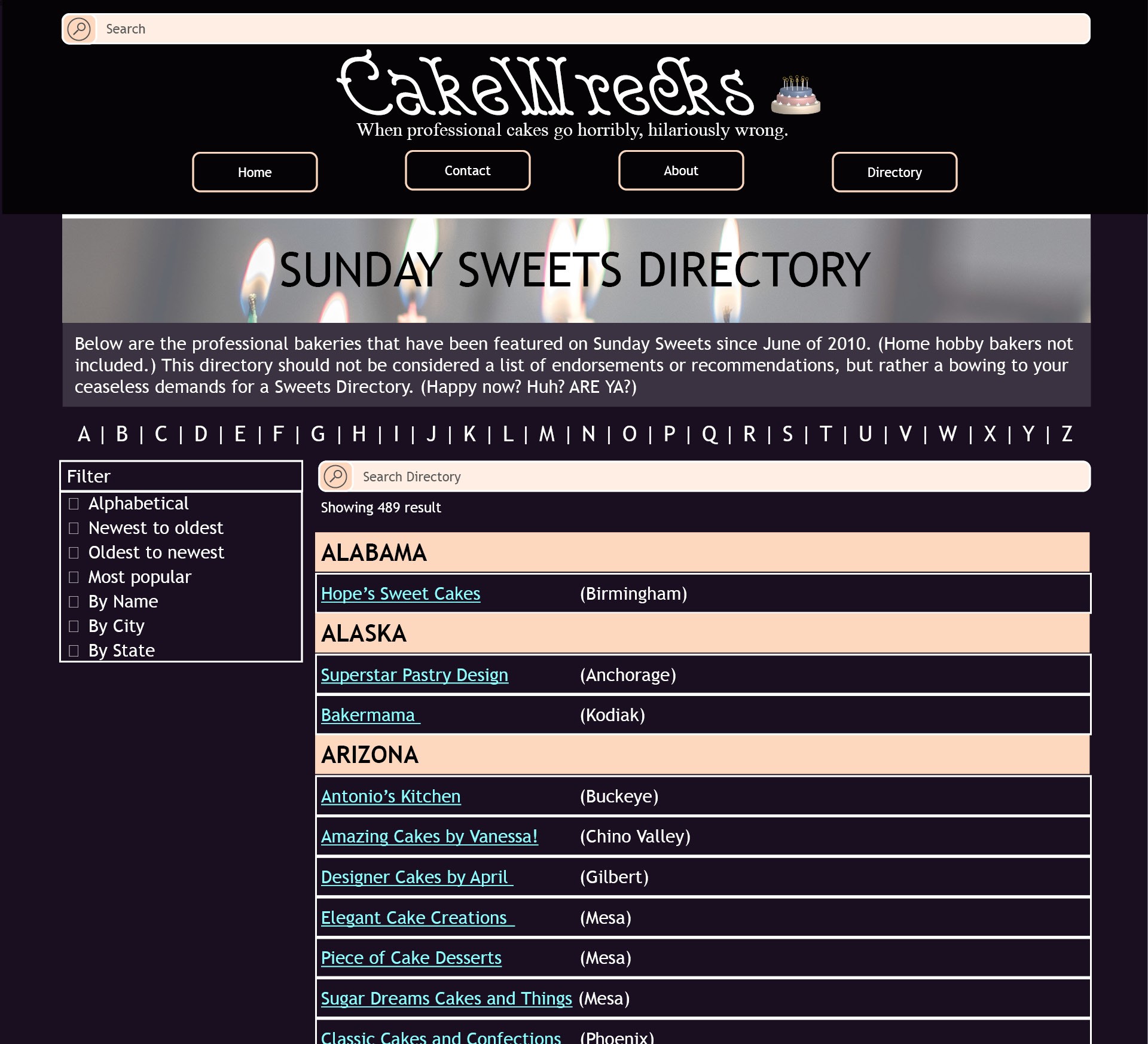
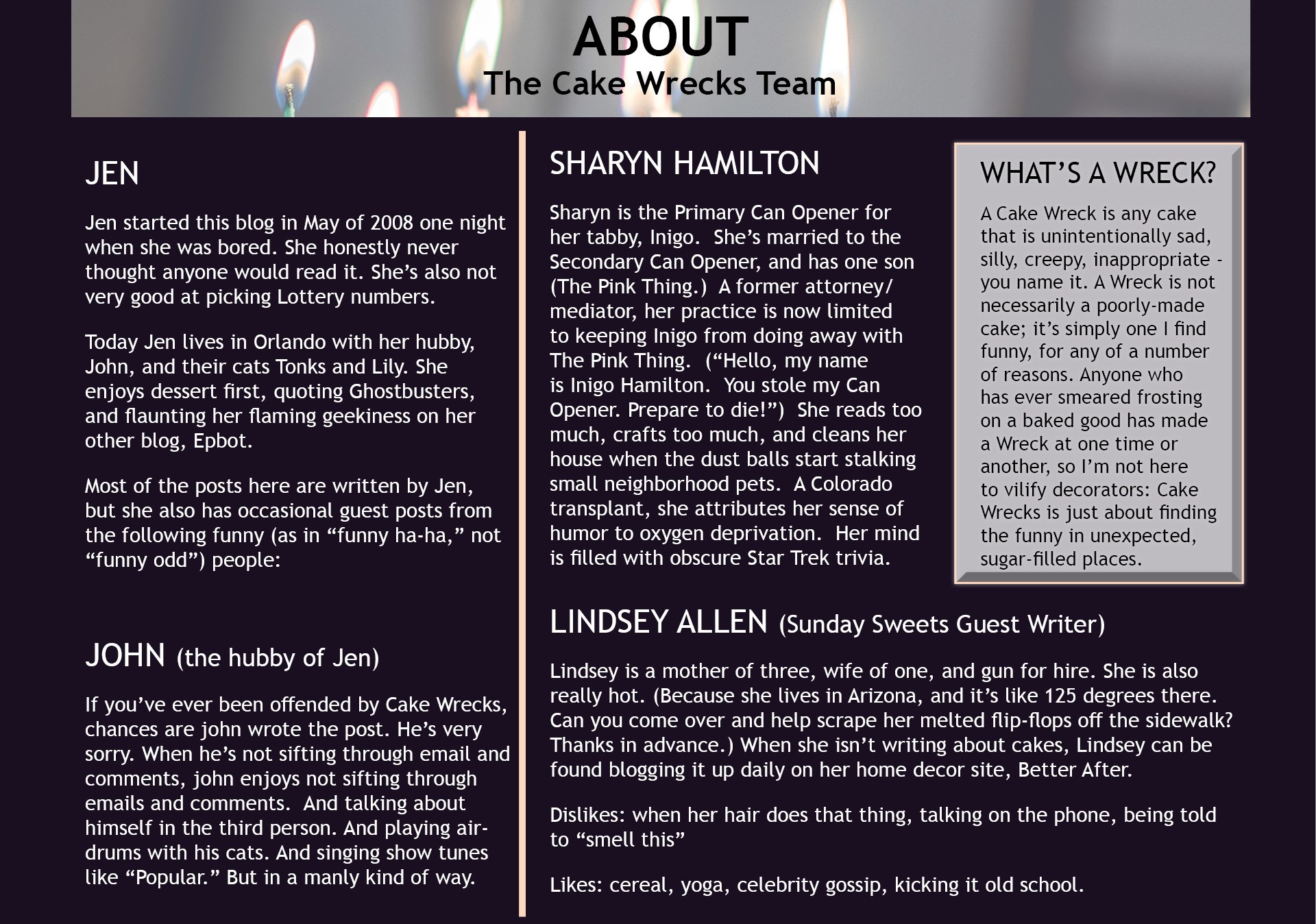
We chose more muted colors for the section headers and background color.
Ads were removed to reduce visual noise. Left aligning text and implementing appropriate separation between different content now allows pages to be scanned more easily.
Search and filter features have been implemented on the directory to save users time instead of scrolling through a long alphabetical feed. Navigation and search features have been addressed by putting the search bar in a fixed location at the top of each page.
Original Site vs Re-Design
